Aidoc • Clinical AI
Supporting radiologists through medical image analysis
Desktop Application • The Problem
The Aidoc desktop application is implemented as an extension to assist radiologists using the 'Picture Archiving and Communication System' (PACS). The system provides notifications alerting radiologists of acute findings.
- However, the limited application real estate presented UX challenges in delivering the necessary data and functionality enhancements.
Design
- Revamped the overall application design to align with current industry standards and usability guidelines
- Restructured key entities and data objects into a more intuitive hierarchy aligned with radiologists' workflows
- Provided creative UX/UI solutions to optimize utilization of the limited screen real estate
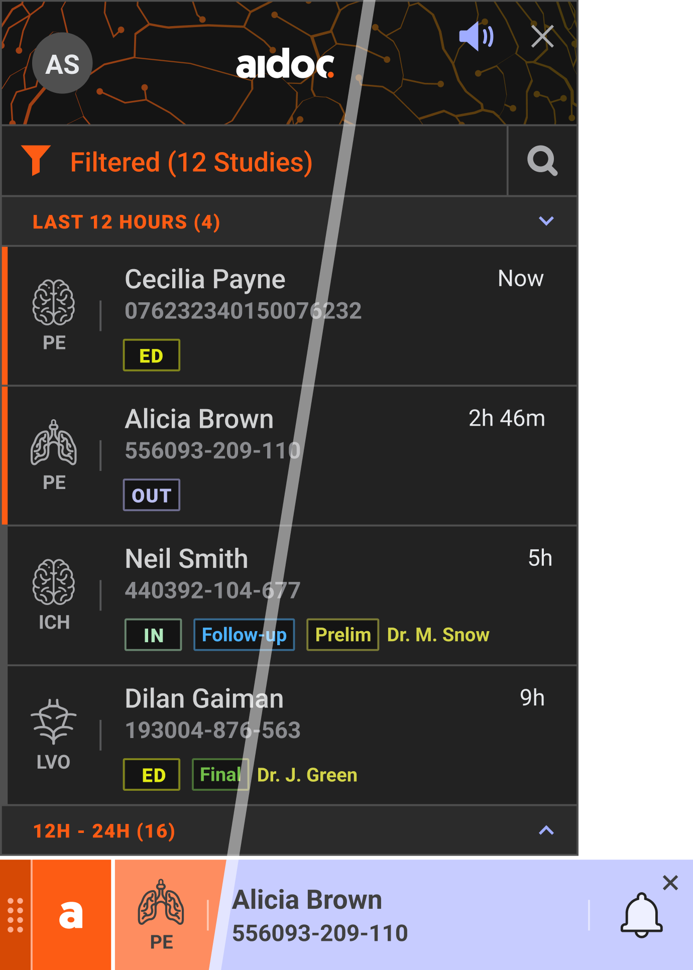
Widget • Notifications list
Notification with relevant scan
Contextual view (with PACS) • Indications on findings + new alert
Accessibility • The Problem
- Repeated feedback suggested that Aidoc's widget color scheme creates accessibility barriers for colorblind radiologists.
- Many were struggling to differentiate between various states and alerts, compromising their ability to effectively use the system.
Research
Research
- Conducted comprehensive research on various types of colorblindness and their specific visual challenges
- Evaluated the feasibility of creating a universal color palette that would serve both standard and colorblind users
Key Findings
- Identified Deuteranopia as our primary focus, being the most prevalent form of colorblindness
- Determined that a single universal palette would compromise usability for both user groups
- Recommended implementing a dedicated colorblind mode with an optimized alternative palette
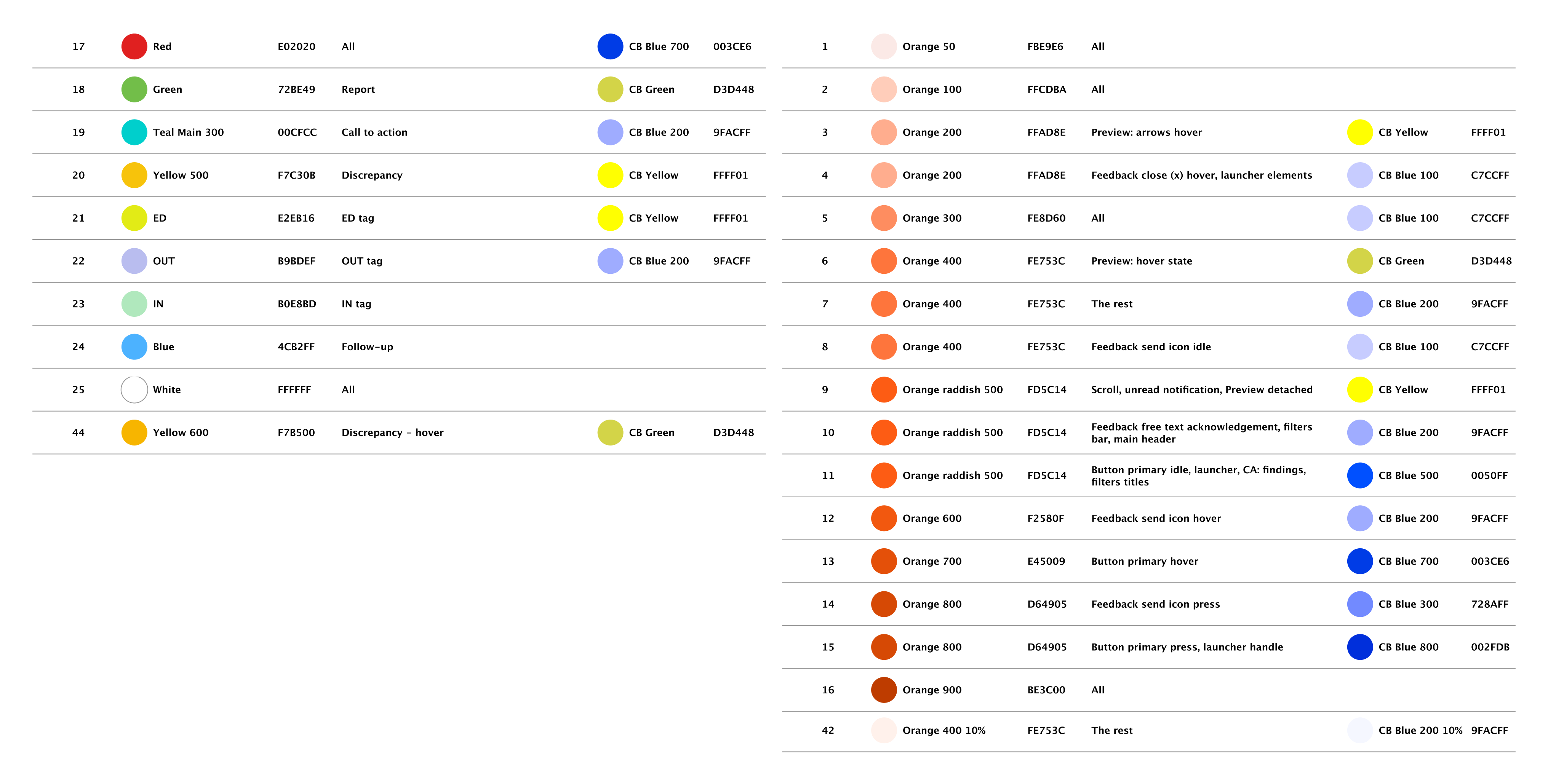
Color mapping • Palette optimized for color vision deficiencies
Testing
- Performed user testing with colorblind participants using multiple color scheme variations
- Validated the effectiveness of the chosen palette through direct user feedback
Outcome
- Developed a color scheme optimized for maximum visibility across the colorblindness spectrum
- Implemented a toggle feature allowing users to switch between standard and accessibility modes (settings)
- Deployed the colorblind-accessible design solution on the desktopapplication:
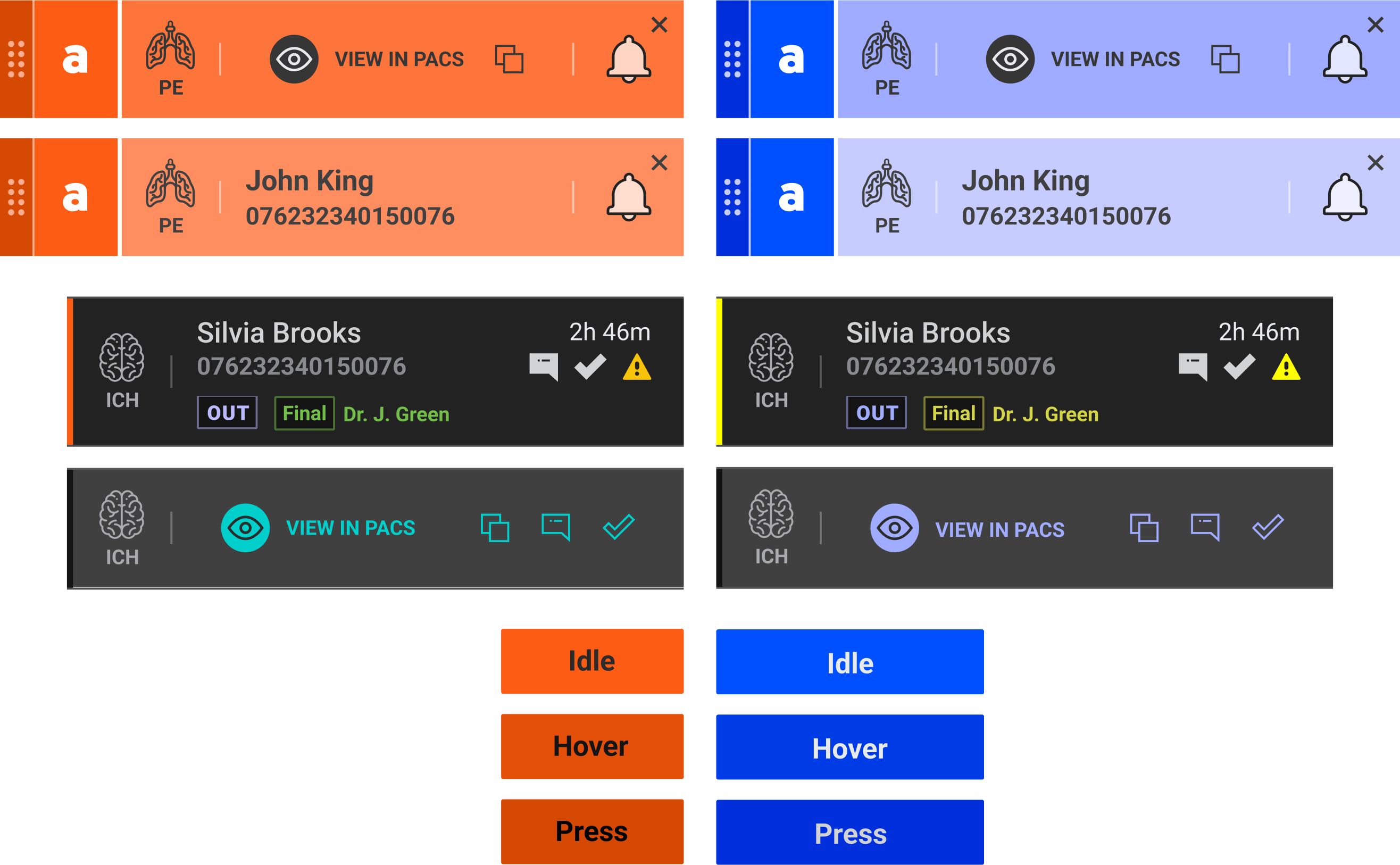
Standard vs. colorblind-friendly palettes
Mobile App • The Problem
- Most of the time, radiologists review CT scans at the hospital using the PACS to manage medical imaging. Still, some situations require urgent radiologist attention even when they are away from the hospital or from the PACS. These acute cases need immediate analysis and response from radiologists, regardless of their physical location.
Outcome
- Researched the 'acute notification' use-case and workflow to identify the subset of the application that requires a mobile interface
- Created a mobile app for radiologists that would address their needs
- Main challenges:
- Extra focus on usability for handling acute, time-sensitive cases
- Limited screen real estate on mobile devices while reviewing detailed CT scans
- Conducted user testing with radiologists to gather feedback and iteratively improve the mobile app design and functionality
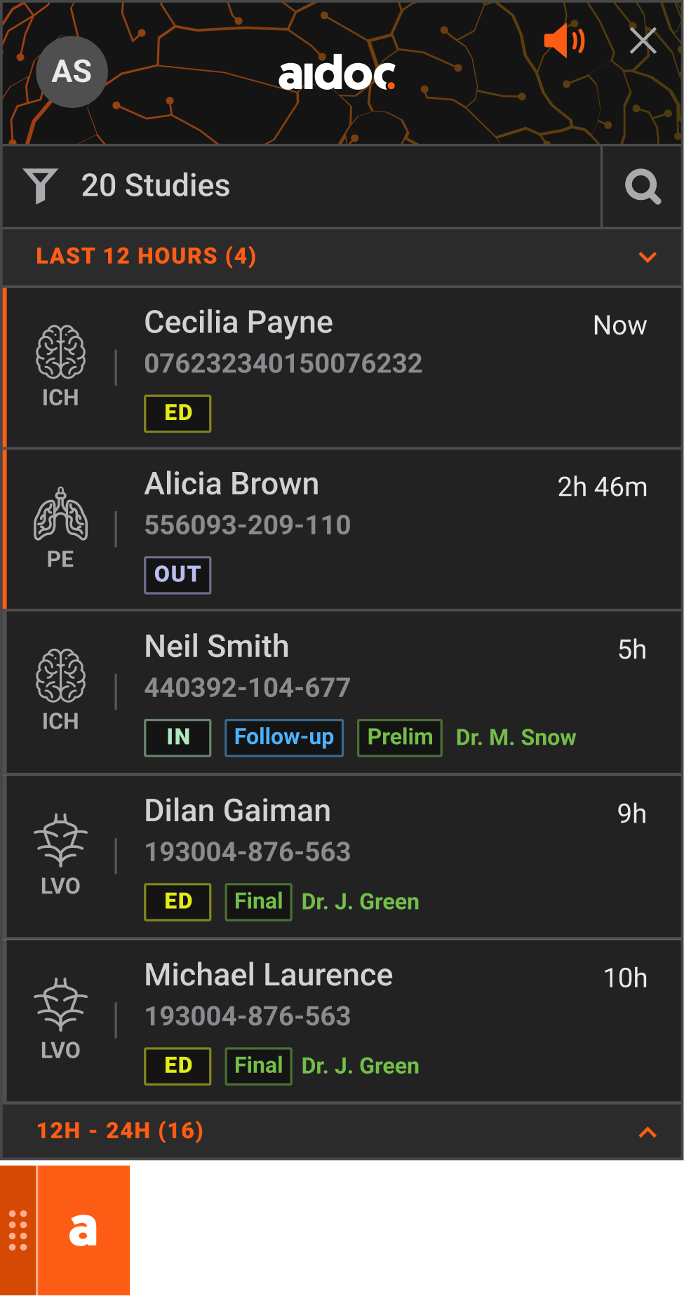
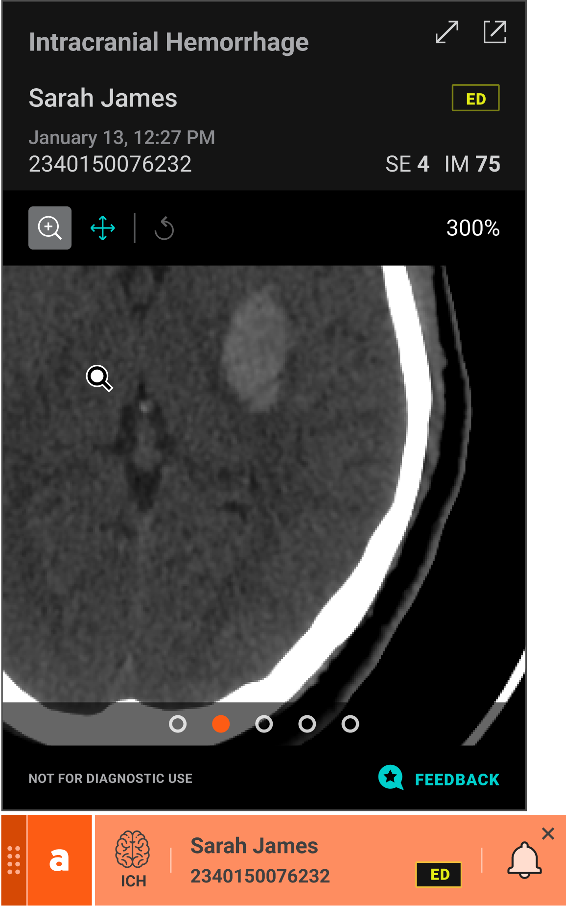
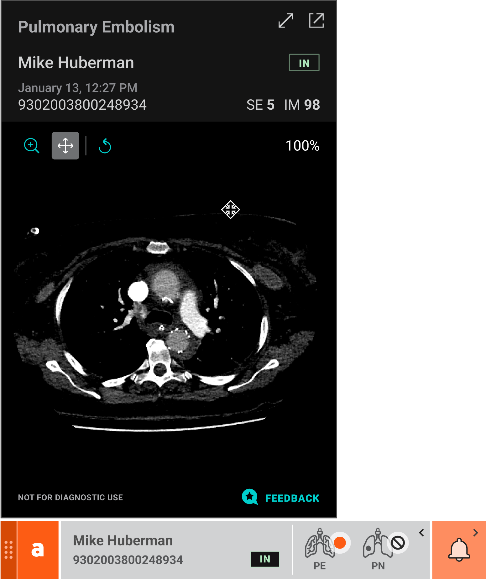
Main Views
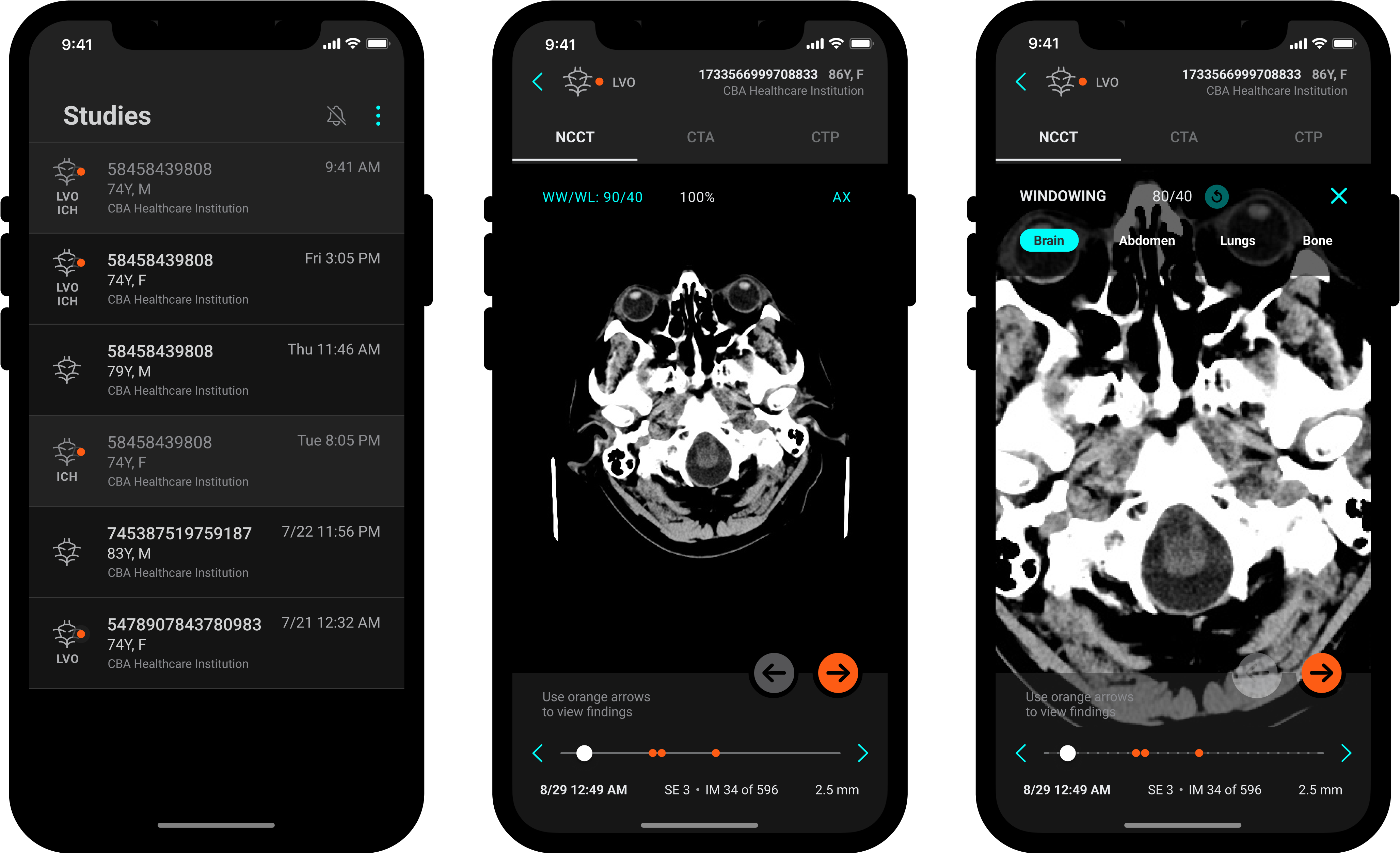
Mobile app • List view; Scan view; Zoom in
My Impact
- Led the redesign of the company's desktop application, enhancing the interface and improving usability
- Conducted user research and information architecture analysis to inform design decisions
- Applied accessibility standards to accommodate color-blindness
- Drove the design of a new mobile application for reviewing CT scans
- Optimized the mobile experience for on-the-go use