Palo Alto Networks • Magnifier
A cyber-security behavioral analytic tool detecting network anomalies
The Problem
Magnifier is a cyber-security behavioral analytic tool that scans an organization's network for anomalies. On detection, it generates alerts indicating event type, severity level, and related device
The main system view lists alerted devices by priority and allows users to view alert types and counts per device. Users can drill down to view device details and related alerts.
- Initially, the device page displayed all information and behavior the system could identify. A side panel listed relevant alerts, but users had to open each alert separately to understand the event sequence and severity.
- Users complained about usability and readability issues:
- Difficulty navigating through large amounts of data
- Challenges in focusing on the most important information
- Trouble understanding relationships between alerts on a device
- Resulting in long and complex security event investigations
Project Overview
Personas
Security Analyst - Monitors, prevents, and stops attacks on organization's digital assets
Scope
- Concept phase: 3 months
Team
- Product manager
- Lead product designer (me)
My Role
- Research
- Concept creation and evaluation
- Wire-framing
- Prototyping
- Visual design
- Testing
Research
Internal Analysis
- Conducted sessions to disassemble the system into components: devices, alerts, and related entities
- Defined relationships between these elements
Research
- Conducted interviews and observations with 10 security analysts
- Observed analysts investigating incidents using the current tool
- Focused on understanding:
- Current usage patterns and needs
- Interaction with system components
- Step-by-step investigation process
Goals
- Understand the workflow of device investigation:
- Identify main points of interest and required informations order and structure
- Determine what analysts look at first and in later stages
- Identify usability issues
- Discover improvements to make the investigational process easier and quicker
Analysis
Working method
- Investigation process isn't a linear uni-directional drill down
- Analysts don't follow a 'naive workflow' of reviewing all devices info before checking alerts
- Instead, they use a 'quick peek' approach:
- Briefly identify the device
- Review alert list, starting with most severe or focusing on a specific type
- Jump between alerts based on interest or relevance to understand the causality chain
- The following workflow describes the analysts working method:
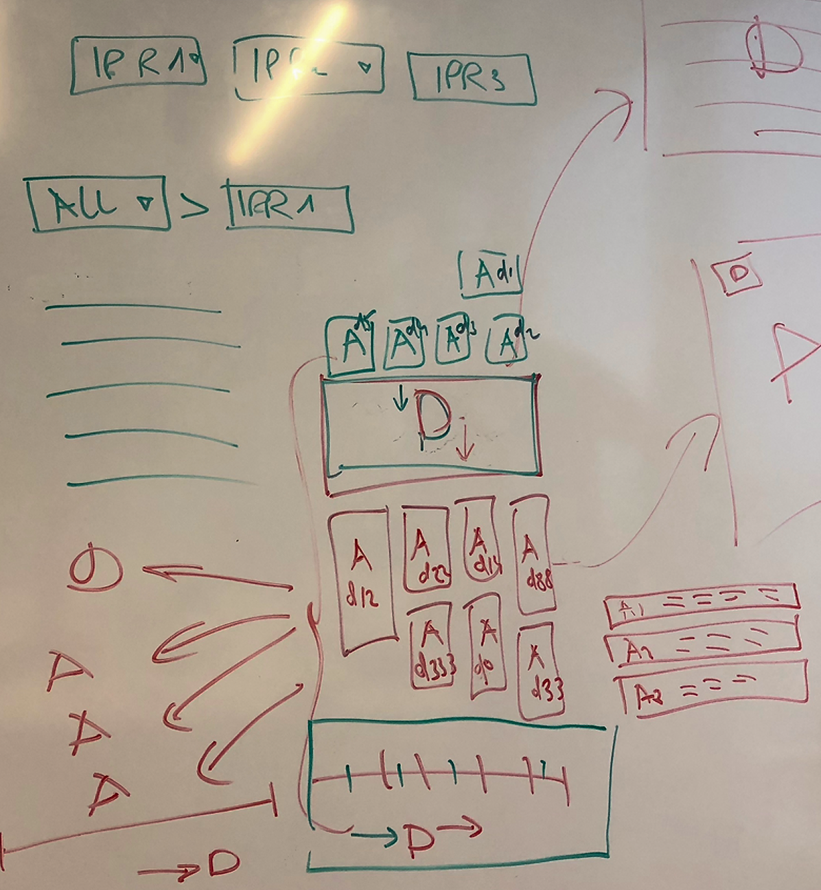
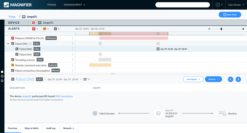
Device Page
- Identified 3 levels of data:
- 'Business card': Most important info for device identification (in the current system: this information was scattered and hard to find, with some crucial data missing entirely)
- 'Highlights': Summary of significant device behaviors with links to detailed data (the original design was space-inefficient and lacked key items as was identified during the user observations)
- Deep dive: Data for specific use cases by advanced users (originally, this section consumed half the screen)
Alerts
- Current design (list of alerts opening full pages) made understanding the incident's causality chains difficult
- Users emphasized the need for a better event sequence view, identifying it as the most crucial aspect
Design
Based on our research findings, I developed a new application concept:
General Structure
- A new "zigzag" interface concept to align with the users working method
- Instead of a main section for the device, with a left bar listing the alerts -
- two cards: device card and slidable alerts card, allowing analysts to reveal information based on investigation focus
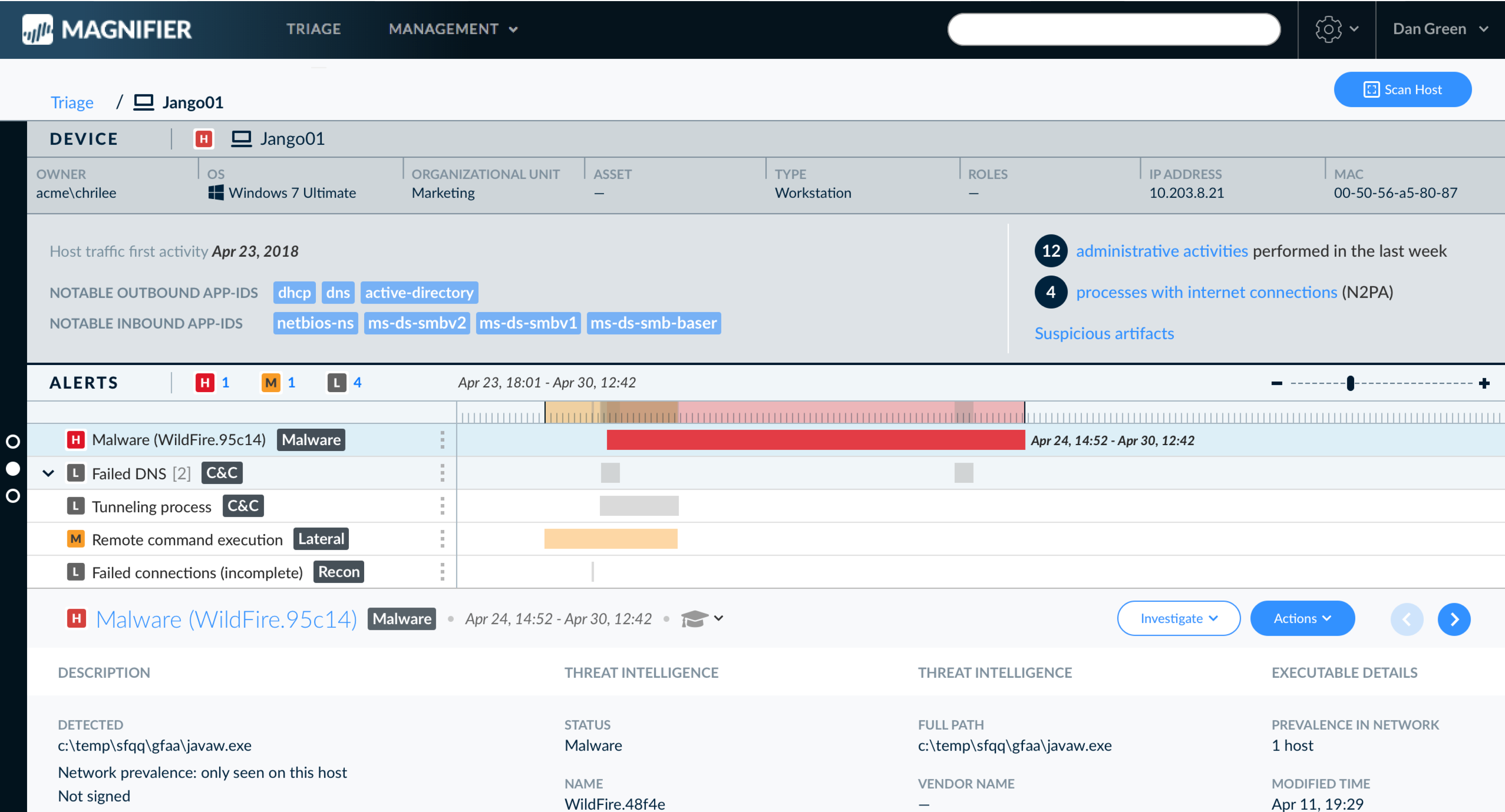
3 viewing modes • Dual overview (left), Device full view (center), Alerts full view (right)
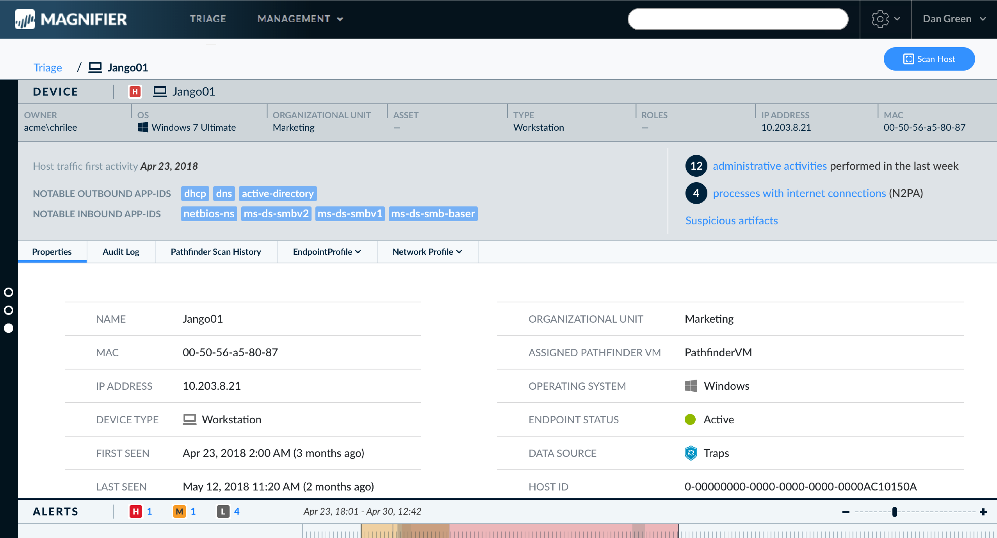
Device Page
- Reconstructed to include 3 main areas:
- "Business card": Main device identification info
- Highlights: Description and main behaviors with links to full data
- Full details section (expandable)
Alerts List and Alert Page
- Replaced list with a timeline view
- Provides overview of events sequence, type, length, and severity
- This overview enables more informed alert selection, streamlining the investigation process
- Selecting an alert expands the view, prioritizing alert info over device info
Navigation
- Added side nav bar for quick access to different pages and depth levels
Testing
- Created a prototype demonstrating the new design concept
- Had users perform same tasks as in initial observations
Results
- New layout was well-received, improving navigation and understanding of device-alert relationships
- Device "business card" helped focus on important data, reducing search time
- The "highlights" section was appreciated but incomplete, later refined based on user feedback
- Timeline view was highly appreciated for providing a 360-degree incident understanding
- Navigation panel: initially overlooked, users found it intuitive once discovered. We planned an onboarding help bubble for new users
Outcome
- A tested working application detailing main behaviors, with significantly improved usability and user satisfaction
Main Views
My Impact
- Championed adoption of UX methodologies to solve product challenges
- Initiated and conducted comprehensive research on system and user requirements
- Created innovative 'zigzag' interface matching analysts' workflow
- Delivered more usable application with higher user satisfaction